Napkin.ai: Revolutionizing Content Creation with AI-Generated Visuals
I’ve just stumbled upon a fantastic tool that I think every content creator should know about. It’s called napkin.ai, and honestly, it’s been a bit of a game-changer for me.
You see, I’ve always struggled with creating visuals for my content. My design skills are, well, let’s just say they’re not the best. I hate fiddling around with graphic design software. Even though I’ve used Canva and it’s great for non-designers like me, it’s still a bit of a hassle. It often becomes such a bottleneck in my process that I sometimes skip adding visuals altogether, which isn’t ideal.
We all know that good images can really enhance the content we’re creating, whether it’s written articles, videos, or anything in between. A picture is worth a thousand words, as they say. But creating those pictures? Not always the easiest task, especially if design isn’t your forte.
That’s where napkin.ai comes in. It’s an AI tool that analyses your text and generates visuals to accompany your content. You simply give it your text, and it spits out these brilliant infographics and visuals that summarise and illustrate your points perfectly.
I gave it a go with some of the webinar content I’m working on. I’m putting together a webinar to help people understand the keyword research and optimisation processes I’ve been using for years to build successful sites. Obviously, I wanted some visuals to go along with it to demonstrate exactly what I mean, instead of just describing it.
So I took a paragraph from the webinar where I talk about the QUEST framework—a five-point framework I use—and fed it into napkin.ai. Within seconds, it produced an amazing graphic that illustrated the whole process I was trying to explain. It captured the essence of the framework in one neat visual, saving me hours fiddling around trying to create something half as good myself.
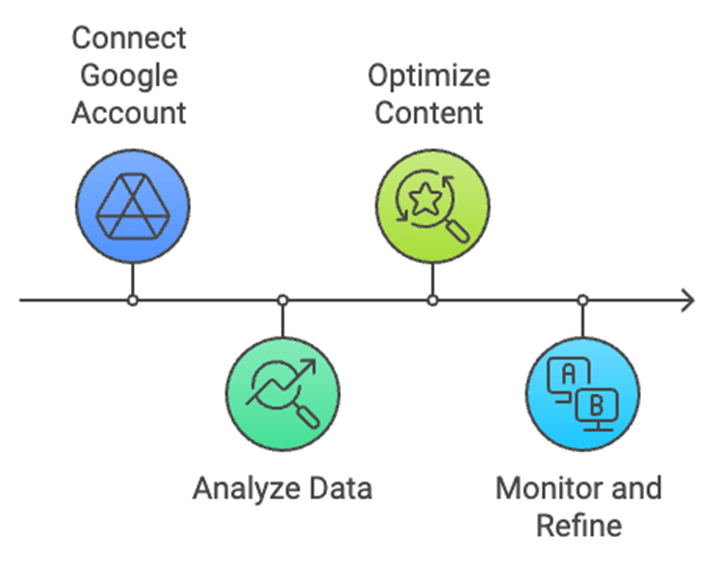
What’s more, I tried feeding it the transcript of a 17-minute training video I did for our new Google Search Console integration on Keywords People Use. I was curious to see how it would handle a longer piece of text. Amazingly, it broke down the content into key steps and created beautiful graphics for each one.
One of the visuals outlined the steps to optimise content for better Google discoverability:
1. Connect Google Search Console to Keywords People Use
2. Analyse indexed content and keywords
3. Identify underperforming queries
4. Optimise content for target keywords
5. Monitor performance and update regularly
And it wasn’t just bullet points slapped on a slide. The graphics were professionally designed, with a nice timeline and relevant icons for each step. It really brought the content to life.
Here’s one of the graphics it created for me:
I’ve tried using AI tools before to create images, but often they mess up the text or the spelling. They might look visually appealing at first glance, but when you read them, they’re a bit of a mess. Napkin.ai, on the other hand, has nailed it. The infographics are spot-on, and the text is accurate.
I think the name ‘napkin’ is quite fitting. It’s like jotting down your ideas on the back of a napkin, but instead, you get these polished, professional visuals ready to go.
What’s even better is that it’s currently free while they’re in beta. So you’ve got nothing to lose by giving it a try. Just head over to napkin.ai, sign up for a free account, and see what it can do for your content.
If you’re like me and visuals are a bit of a pain point in your content creation process, this tool could be a real lifesaver. It makes your content pop in a way that plain text just can’t achieve. Plus, it saves you the hassle of wrestling with design software or the expense of hiring a designer.
So, give napkin.ai a go. I reckon you won’t regret it. It’s certainly made my life easier, and I can see it becoming a staple in my content creation toolkit.